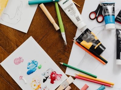
If you’ve ever felt instantly drawn to a brand before you even read a single word, there’s a good chance color had something to do with it. Color is one of the fastest ways our brains process information, and in branding, it quietly communicates emotion, trust, personality, and even value. For small shops especially, color isn’t just a design choice—it’s a psychological tool.
Studies show that people form an opinion about a product within 90 seconds of first seeing it, and up to 90% of that judgment is based on color alone. That’s huge. It means your brand colors are already telling a story long before your product description ever gets a chance to shine. (You can read more about this research via the Institute for Color Research, often referenced in branding psychology studies: https://www.colorcom.com/research)
Different colors trigger different emotional responses, which is why intentional color choices matter so much for handmade businesses and creative brands. Blue, for example, is strongly associated with trust, calm, and reliability. That’s why it’s often used by banks and tech companies—but it can also work beautifully for shops that want to convey professionalism, dependability, or a soothing presence. Psychology Today explores this connection between blue and trust in consumer behavior here: https://www.psychologytoday.com/us/basics/color-psychology
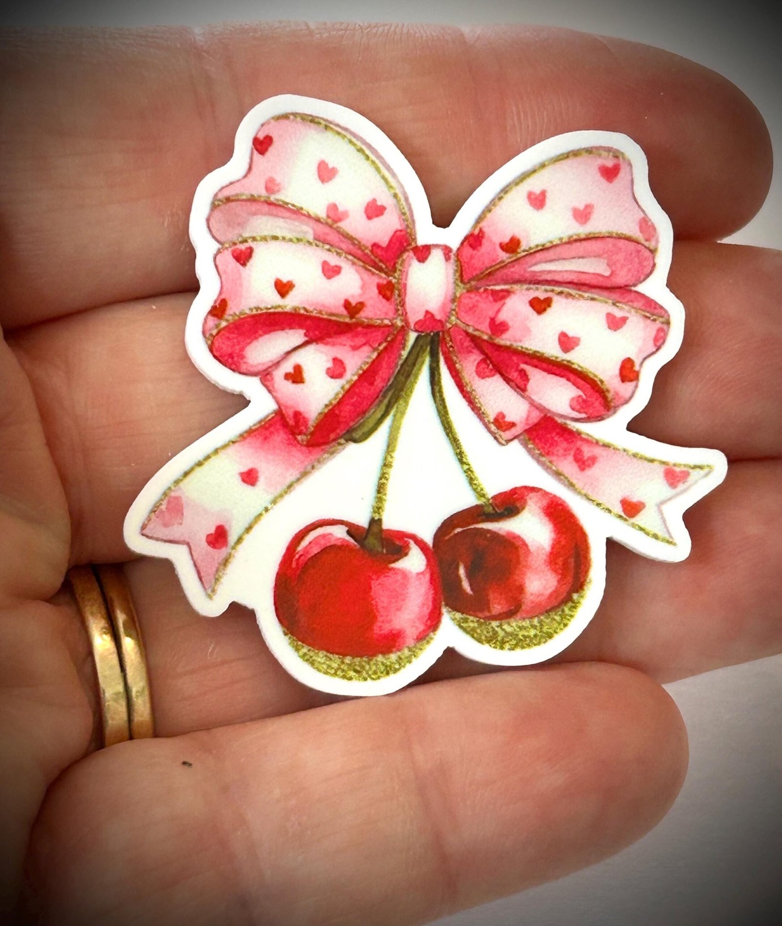
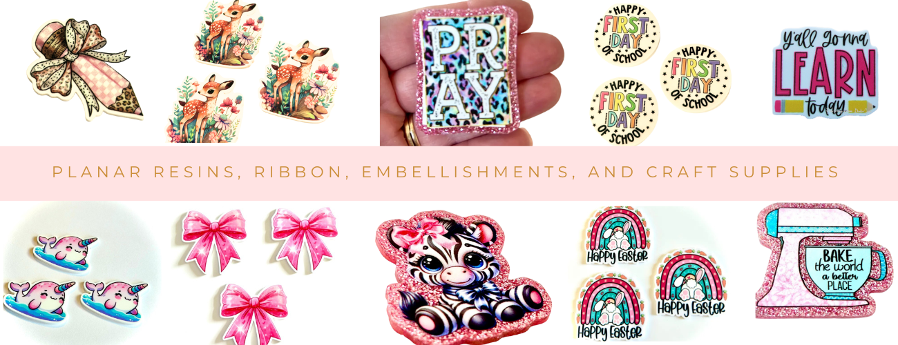
Pink tends to evoke warmth, creativity, nurturing, and approachability. It’s especially popular among lifestyle, beauty, and handmade brands because it feels friendly and emotionally safe. Depending on the shade, pink can feel playful and whimsical or soft and sophisticated. That flexibility makes it a favorite for small shops that want to feel both personal and polished.
Green is closely tied to nature, balance, and growth. It’s often associated with wellness, sustainability, and creativity rooted in the natural world. For makers, artists, and eco-conscious brands, green subtly signals harmony and authenticity. Verywell Mind has a great overview of how green affects mood and perception: https://www.verywellmind.com/the-color-psychology-of-green-2795817
Yellow is the color of optimism and energy. It can spark feelings of happiness, warmth, and friendliness—but it’s also a color that needs balance. Used thoughtfully, yellow can make a brand feel cheerful and inviting. Overused, it can feel overwhelming. This is why many brands use yellow as an accent rather than a primary color.
Purple has long been associated with creativity, imagination, and luxury. Historically linked to royalty, purple still carries a sense of exclusivity and artistry. For creative entrepreneurs, it can signal originality and a slightly elevated experience. Color Meaning dives deeper into purple’s psychological impact here: https://www.color-meanings.com/purple-color-meaning/
When choosing brand colors, the goal isn’t to follow trends—it’s to align your colors with how you want customers to feel when they interact with your shop. Do you want them to feel cozy and nostalgic? Confident and inspired? Calm and cared for? Your palette should support that emotional experience consistently across your website, packaging, social media, and product photography.
At the end of the day, the best brand colors are the ones that feel like you—but backed by intention. When creativity meets psychology, your brand doesn’t just look good… it connects.
Like what you’re reading? sign up for our monthly newsletter, it’s free and chock full of great information!